Posts Tagged ‘ 2012 ’

Well 2012. thanks


Well as the year of 2012 which was suppose to end everything comes to an actual end i just want to reflect on the things that really made this year amazing!

   Image

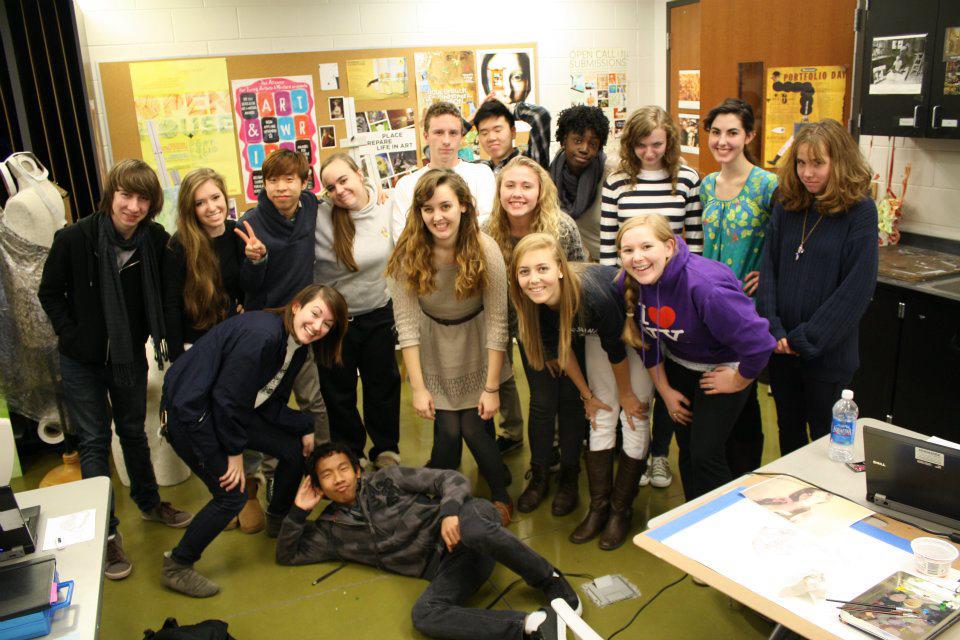
 The wrap of my high school life was ever so perfect. I had an amazing art class that follow me for all of my high school career and I can’t say enough how much all the friendships that came from that really mean to me!  I was so blessed to be surrounded by so many talented people that happen to be my best friends too!

      ImageI got to experience prom with a date which is was also one of my bestest friends. Thanks to him for making my wish to have a date to prom come true. I can’t  emphasize that enough how much that means to me. As an artist at the high school level I got to create what i really wanted and create the environments that I dreamt for years then had the pleasure to debut the body of work to the public along with my peers senior thesis work too!

Image
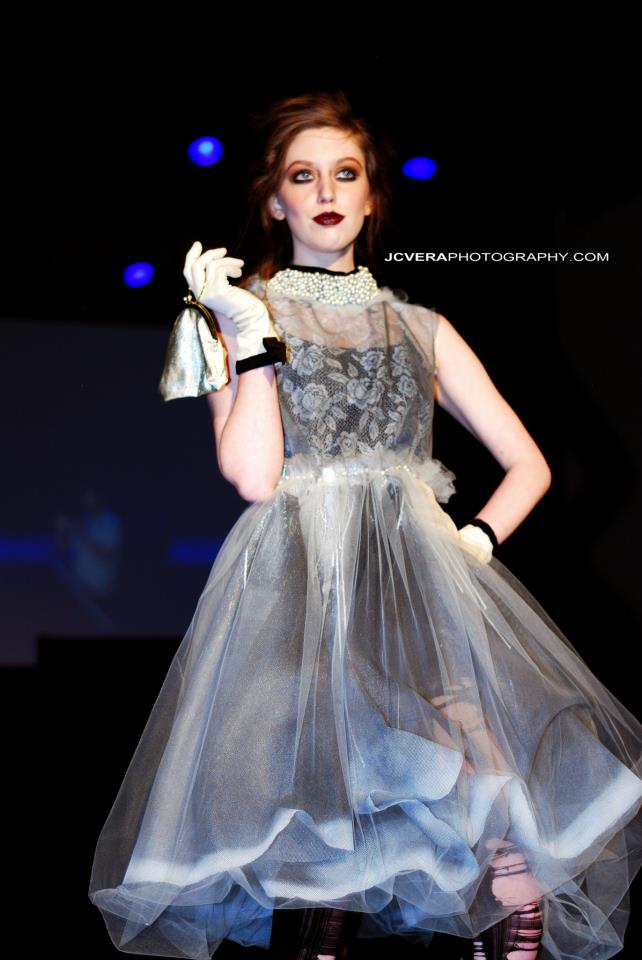
Meanwhile, I also was chosen to be the first high school level designer to ever show in a RVA Fashion Week event. I was lucky enough to be schedule to be in the finale show and got to debut my first truly full fashion collection entitled Gridded Organza in a professional environment. So thank you for RVAFW and I hope to work with this amazing team in the near future! All in all the ending of my high school life was amazing! I solidified friendships, artistic voice, and goals as an artist. It was the last time I was a little kid and it was amazing and I will never trade with anything in the world.

     ImageNaturally in the fall of 2012 (since I graduated from high school) I began my new journey at MIC/A (Maryland Institute College of Art!) Literally the best thing I could of done for myself. Sure I always wonder what would happen if I went or applied to more school but in the very end I and pretty solid that I belong at MIC/A. I create a new life for myself with a new but strangely familiar group of close friends. I am just overly too thankful that I had the luck to meet each and everyone of them! As an artist I got to start fresh but still have the advantage of knowing all the knowledge that I already acquired during high school. I got to began to make something of myself and really begin to start craving into my future.

Image

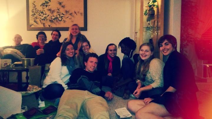
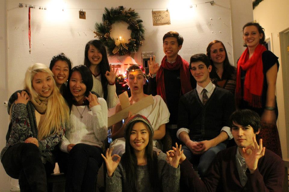
  And to combine them together I got to celebrate the holiday season with both parts of my life; first at MIC/A which our first Christmas as a group of friends together and we had the amazing opportunity to really bond and show our love to each other. Of course back at home  I hosted my annual Christmas Potluck for my art class and we did the same and swapped stories about our new lives we made while still having nostalgic of the times we spent with each other.

I got it! Through the London Fog


I finally got it! I thought of it during my very very late nights surfing the web. The perfect theme for me to center my next haute couture styled collection. Through the London Fog. I want this coming collection to show London’s iconic fashion trends and look through the ages. I also wanted to keep a more mysterious outlook on this wonderful place with its very infamously known fog. I want to highlight the natural weathering of the buildings and landscapes and also how it effects the people lifestyle because of this strange thing that only happens in this place. I was always drawn to the clean,polished style of London along with the very gritty atmosphere that it can seem from an outsider like me. Also I want to highlight the also very lively art scene in London and how it also clashes beautifully with the stable,royal, tailored look of London. Overall I want to create a viewers version of London. I done now. Back to blogging silly stuff. Get ready for a F/W 13 Collection inspired by fog and London. And of course with my personal asthetics too.. like art deco,victorian…..I can’t reveal too much except for UMBRELLAS!

Where the thank you begins…


As my wonderful teenage years I just want to send out a few thank yous to my dearest friends.


Jennifer D.


I have known you since my second year of first grade (the year that I finally figured out the English language.) I still vividly remember sitting next to you in the classroom with Mrs. Farthing teaching us the basics. We both moved up to Mrs. Purdue and with her infamous Australia desk where both of us were since to once in our youth and still have the image ingrained into my head of the duct tape being pulled infront of my face since I was such a chatter box. Third grade we were split 😦 Fourth grade in Mrs. Drake’s god awful class, so bad we both swung facing the hill on the swings hoping she won’t see us when she call everyone in from recess. Fifth grade was the year that we ,including Tyler and Shelby were the shizz….or at least we thought we were. And we can forget our found love for Charmed! XD

Middle school, sadly not the most exciting times for us but still cherish the memories in Ms. Tanner’s class and asking her the day before our CFA auditions “So what should I say about our ‘favorite’ artist…” and her clearly giving us the answers to every quiz and test…your options are AAAAA…b..c..d..again AAAAA..b..c..d.

What really made our friendship to me amazing (to me) is the fact we shared at least one class with each other everyday in high school. From the dreaded days of the trailers, Ms. Cooney’s totes relaxed class, Mrs. Brown’s god hard @ss class to now around amazing CFA family. The days you use to drive me everywhere; including but not limited to Panera,Starbucks….

Throughout the years we both learned so much about each other and our similarities and differences I can always say that you were my best friend since 1st grade! We both live in different worlds, your’s including softball, hermitage, field hockey, etc and mine with VMFA, fashion jank, Tucker ,etc; we both still have the middle ground that we both share. In a sense we kind of balance each other with your logical thinking with my kind of logical but more right sided mindset. We make an amazing duo! An unstoppable team! You always knew what I was thinking about and our witting,blunt sense of humor is what we are both remembered by others.  I can’t tell you have happy I am you are pursuing a Engineering major! Very fitting for you! I know that you can make it though those classes and pass with flying colors 🙂

I will cherish my plushy Jack,plushy red elephant, and sweaters forever!

Thanks for being an amazing best friend-

Harry-


gridded organza by: harry trinh

Backstage with designer Harry Trinh and Assistant Caroline Smith during RVA Fashion Week Finale Show

Well it’s all done and over with. The hype ,practicing, sewing,spray painting,beading, and constant emailing has finally stopped. Yes, what a bittersweet ending to all of this amazing work that me,the RFW team, and the amazing designers…oh the MODELS too. They were absolutely amazing!

So everything was overall very nicely layout as in the fact of the designers’ collections were clearly labeled. Yet, naturally to any big organized event there is a bit of conflict but really nothing the audience can see. Just a lot of running around and making sure things were runway ready. The hair and make-up people were amazing and absolutely helped pull the whole look together. Also I can’t forget to mention my lovely friend and perfect assist Caroline Smith. She really helped and made sure everything look perfect for the runway. I can’t give her enough credit on how much she helped me out. She will be amazing this fall semester when she goes to Parsons School of Design.

But yes, I think making all my models watch the Dior Haute Couture 2011 show really helped them achieve the poses,walk, and emotion that was suppose to go with the collection. At the very end I was just blown away from how everything looked and everything looked almost Dior…hahaha. The added gloves and handbags really gave a more upscale tone to the outfits. Being one of the only high school designers I feel that this was a huge success! Getting my name out there,having a real life experience, and really getting more exposed to people I don’t know really. I am so grateful  that I had this experience and maybe still trying to keep this love of fashion into my college career in MICA. I still want fashion to be a good sized part of my life but I can’t ignore my love for entertainment design and just the overall vision of the show. My greatest hope is to for my senior thesis in college to the build sets that will showcase and work together with my collections and interact with my audience. I am always trying to think of ways to some how work all my loves into one huge project.

Very soon from now I will have full coverage of my collection but for now here is just a taste of it.

We are not made the same.


Call me silly to make a whole blog post about this but really it really cranks my brain sometimes when I find a moment to really think about it. Ever since last summer (damn time flies) I met one of my closest best friends at that summer residential. At a glance when people first met  us that thought we were practically the same person with the same style….the list goes on and on. Sure some of it was true, we do share a similar childhood and family background, both are Asian, both artist,perfectionist, and do I dare to say we are both somewhat pretty stylish. But the more we really got to know each other the more we (or I ) found we don’t share in common, which isn’t a bad thing it was just really shocking to me.

Ironically enough we were both working on clothing collections at the same time recently. His entitled “Black and Gold” and mine entitled “Gridded Organza. ” Right off the bat there is stark contrast in titles. His a very direct and gripping and overall a very eye catching title where everyone is fully aware in general what this is going to be.  With mine, “Gridded Organza” its not as direct yet still somewhat of an attention grabber. Not necessarily from the actual picture but the underlying tone of wonder and what is really a “Gridded Organza.”  So point one!: He is more direct and affirmative  contrasting with me with the more subdued and passive sense.


Looking a bit closer to each collection, lets start with his. Black and Gold, every viewer is already prepared to have the visual spectacle of metallics and blacks playing up the more graphic nature of the new colors. Seeing just a few pieces of his collection the most striking characteristic of all of it was the very unique play with masculine and feminine elements that were both interwoven within each other, almost blurring what is really masculine or feminine. The play with black flowing satins detailed with very geometric gold patterns plays around with your senses of what is structured and what is fluid. Overall, the hyped up contrast is the prominent feature of this collection and the illusions of form with flat planes curved to the body really gives it a more architectural edge to this collection. Having both the fluid lines of the satins, the Alphonse Mucha inspired scroll details, juxtaposed on to stiff structural elements, and the strong sense of tailoring gives this collection a more graphic sense. Sadly I not aware of his intent or his artist statement to this collection but hopefully I will be able to add that in a later date.


Gridded Organza, Not having an over descriptive title the audience won’t really have a clear idea of what this collection is going to be about. The word gridded implies an idea of structure and hardiness and organza gives a sense of more organic, nature inspired imaginary. Having the luxury of knowing more in depth about my collection I can explain more about it. Having the idea of structured softness it really makes you wonder, what in the world is this going to be? The debuts, the dresses are made out of window screening overlayed with delicate lace work which has been hand beaded with pearls adding just a hint of more emphasis of the contours of the whimsical outlines of the patterns. The on the folds of the dress it has been lightly sprayed with metallic  sliver to give it just a hint more depth and form from the very flat matt gray of the window screening. Overall this collection focuses mostly on detail work of each dress and the subdue qualities of the patterns, sheerness of the pearls catching the light and the translucent quality of the dress allowing the viewer just to catch a glimpse of the shape of the body.


To make is clear the true contrast here is his sense of graphic and soft elements working together to create this visually exciting new look that makes you question the qualities of what is structured/geometric vs soft/ graceful ? With mine, it makes the viewer take a second glance at each elements making them exam what it really made out of and how little details can come together to pull a whole united look. As artist we employ totally different elements of design and really play them up to our advantage. We are both very skilled at our craft and both get raging reviews on it but funny enough no matter how similar the reaction we get from our art its absolutely amazing how different they are.

He beckons on the shock and wow factor of contrast and dramatic lighting and occasionally more risky topics but it is counterbalanced with the soft fluid lines and the absolutely stunning gradating colors giving them a calmness in a world of negative impacts.


I beckon on the shock value of details which forces you to take a long and deeper look into my art. Also I try to draw a upon the more nostalgic characteristics our past but them making you question it by hidden dark messages within this very idealistic setting.  I am the person who makes you wonder “what is ideal?”


Not saying we are totally different people in every way possible but pointing out the obvious then picking it a part really makes you think what really makes you or the other person tick. What about the graphic/ soft contrast that DJ is so drawn into and what does detail and subdue passive ideas do to me?

RVA Fashion Week 2012, Gridded Organza by: Harry Trinh


Hi everyone, just wanted to tell everyone about my next show that I am part of. I am part of the honorable RVA Fashion Week 2012. This year I get the lucky opportunity to premiere my latest and last collection of my high school career entitled Gridded Organza. I’m definitely hoping to end my high school days with a bang. Here is a little more about my intent of my collection

RVA Fashion Week, Harry Trinh

Artist Statement

Gridded Organza is a visual summary of our relationship (in art) with the natural world. We as humans throughout every culture and every time period has always been intrigued with the complex yet simple nature of nature. Because of this interest we have always tried to convey the same visual spectacle that our environment shows us everyday.  The flaw within this idea of wanting to convey this beautiful is that for humans we need logic to translate this image . In result we try to push these organic objects into grid patterns (thought process) that we constructed ,to make it fit to our standard of understanding. Showing a resist to our logic we get this byproduct of this sublime tension between us and nature. This tensions gives way to us creating our own version of “organic” by bending our grids into similar shapes that natures creates effortlessly.

For more information of this event please visit http://www.rvafashionweek.com

Shine a little light on…


This slideshow requires JavaScript.


After realizing my status on my Scholastic Art and Writing and not being on the national list made me think first how humbling it was to be first even considered to be looked at and secondly how subjected art is. In this case I wanted to really let the viewers inside more of the thought process of my art.

To really understand what my thought process is for my art is to really understand where my inspirations come from. This might sound a bit silly but most of my mannerisms really stem from first Mary Poppins with her grateful,polite, yet cleverly snippy comments she has. The verbal tension of her very proper grammar yet very carefully crafted comments almost makes you think a little more what she really means in her comments. Desperate Housewives, first the setting…the idea of placing a story in a fictional yet very familiar location is just so ironic. Looking at it with a glance it any other suburban street yet the more you look at it the more you realize its the idealized, fictionalize, beautified version of the very streets most middle to upper class families live in. Even deeper Bree Van Da Kamp, the red head, played by Marica Cross she is just an interesting contradiction in itself. She is conservative, proper,polite, neat, just overall an idealized housewife yet her life is horrible because of her hopes for being that perfect thing that everyone compares her too. Behind those string of pearls is this complex personality woven into this state of being perfect.

Now understanding my inspiration of domestic, idealist yet flawed concept here is more of about the pieces I make. I currently is still working on miniature rooms which depict these somewhat mellow dramatic situations of very familiar happenings yet set in a place where is blurs the worlds of real and idealist. Everything is perfectly painted and drawn in by hand. Every piece of furniture,wallpaper….is done by hand which gives me all the control on how controlled or tight or how loose it can look. Also since it is all done by hand nothing is ever the same,no matter what which for me gives is that more quirky tone which allows my art cross the boundary of being a craft to “art.” The line of design and art is truly blurred in this case.

After creating this perfect atmosphere here comes the fun part. In every room so far there is something oddly out of place. Yet, at the same time these things that are out of place happen almost everyday like scattered papers, broken plates, opened cabinet doors….but having these things in this place creates the tension that is needed for these pieces. It breaks yet falls into the barriers of being in a perfect world. Perfection leads to destruction since there is no way to live up to un-human standards.

The actual act of photographing is just too fun for me to explain. The concept of trying to create “natural” lighting with artificial means is just too ironic for me to handle. How the light reflect and how is cast shadows into the room which just adds to the illusion of realist idealism.

Chinese New Year 12′


Anyways here is just a little photo montage I put together for our Chinese New Year decor for this year. The idea of decoration for such a foreign holiday in a very colonial home is very intriguing. The style of the home orginating for a very Europe style where the buildings have no trace of any Asian influences contrasting with the very specific style of Chinese New Year gave me an interesting task to battle every year. To be frank about it is more difficult to decorate for Chinese New Year then Christmas. Since Christmas is a Western holiday the decoration naturally fit into this style of home. Columns, railings, fireplaces…key elements or places people usually deck the halls at but with the New Years things are a little different. The ornate vivid styles of the Chinese New Year is decor can get a bit overwhelming we need to figure out to incorporate it into the current layout of the home.  We wanted to gear away from the “lazy” way of just sticking a bunch of randomly places “posters” and lucky symbols everywhere. We wanted to work with the architecture and make it fit into the Western format. The contrast of the two things created a very unique look to it with a lasting impression for people who were never really exposed to this holiday. We wanted to give a very sophisticated yet warm overall tone. We wanted to get rid of the stereotypical idea of an Asian home with poorly placed decor.

Music Quarter- Artist Statement


Disquieting details. The illusion of the real world. In this piece “Music Quarter” this is an recreation of an harpsichord in grave detail.


Chinese New Year at Disneyland: The visual and cultural perspective.


This year’s lunar new year celebrations have been on a rise and Disneyland won’t give up an opportunity to monopolize on a cultural celebration. In a visual perspective its quite pleasing to the eye. Frankly, it’s nice to see Chinese decor in such a well manicured location.  Don’t lie, most of the time Chinese American communities can be a bit gritty and not in the most cleanest state so sometimes the sophisticated designs on the decor can be covered up by the attention of the dirt around it. Not dissing on the Chinese but just generally speaking sometimes.  Having a beautiful background to display the colorful decoration is a nice overlay to the minimalistic area of the “its a small world mall.” The creams and hints of gold with the trimmed up greenery is nice to contrast with the vivid bright red satin lanterns, glittery dragons, and bountiful cherry blossom trees. Really having nothing competing with the attention its a nice showcase of these cultural treasures. Even better is the images that occasionally pop up from Disneyland Hong Kong of the Lunar New Year decoration especially in Main Street. Having the very Western Victorian architecture of Main Street with it’s ornate ,pastel detailing of the building overlayed with garlands of cherry blossoms is a very Western but still welcome approach to displaying the greenery. The idea of using to highlight rooflines,doorways,windows is a nice change or addition to the traditional tree display.  The trees lining the road are decked out with larger then life wooden lucky envelopes creates a new Western idea of ornaments. And with the “fu” symbols basically plastered in every window,door,column…I very much enjoy this almost Victorian approach to this very Chinese traditional look. Also to add the very drapper orange trees trimmed to still fit the Victorian landscaping with keeping the Chinese vibe.  And I can’t help but love the firecrackers flanking every window…

The reason why I absolutely adore this look perspective is that it is a very view on a old look. Having people that have never been exposed to the traditional look of the holiday it creates a much need renewal of how to display this very specific look. Unlike Christmas ,Lunar New Year have very specific colors that can’t be messed with. It only constant of red,gold,pink,yellow, and hint of black. The very limited color scheme creates an difficult problem of how to decorate with these colors without it being overbearing. Too much red can be a bit jarring but just adding very vivid hints and focal points is just a perfect balance to keep it sophisticated, festive,…. It combines both of my loves, the love of the Victorian and the Chinese. It kind of echos the looks of Hong Kong and Southern China of the 1940s…Having the finest in Chinese goods and European goods in the same room working together…not visually fighting for attention. The subdue details of both parties work together to create an harmonious and glided look of that time period.

Culturally, having the background of the Victorian era, the time of Industrial Revolution, Europeans beginning to “trade” with China, immigrants being abused… The idea of that time period completely contradicts the whole idea the the Asian culture on the rise in the past few years. The idea of un reserved celebrations, no true social boundaries of who can or can’t we talk to. Having the idea world working side by side is a nice change. Chinese just adding a new foreign touch to the very domestic and familiar atmosphere of Disneyland. Having it seep into Disneyland allows everyone to embrace it with comfort and allows everyone to easily relate to the whole foreign celebration.